Time Line Controls in Graph
The Time line controls at the bottom of the Graph
tab in the Stations View include:
You can use the triangles to view a shorter period and thus "zoom
in" on the data:
Click and drag the small triangles at the
ends of the time slider with the mouse:
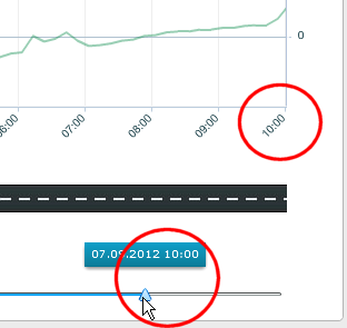
The time displayed above the slider triangle shows the end or start
time of the displayed data.
To display the start time and the end time
simultaneously, click the time line between the triangles:

To move the selected shorter time period, drag the selected blue line
in either direction.
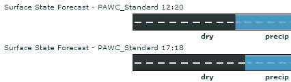
When available, you can also view forecast data in the Graph tab:
The following features show that the displayed parameters are forecast
data, not observed data:
The graph lines of the forecast data turn
into dotted lines.
The background of the graph changes pattern
(the right side of the graph).
The mouse-over details of the graph lines
include the text "Forecast".
You may also have separate forecast items available in the list at the
upper right corner:
Click the Add icon  and look for items indicating forecast data, for example, "Air
Temperature Forecast (Issuer and
Issue Time).
and look for items indicating forecast data, for example, "Air
Temperature Forecast (Issuer and
Issue Time).
When available, you can compare forecasts
with different issue times by opening all of them.
NOTE:
Forecast data will only
be displayed if provided by your forecast provider.
Graph Tab Basics
Graph Lines
Graph Tab States
and Icons
Application Parts